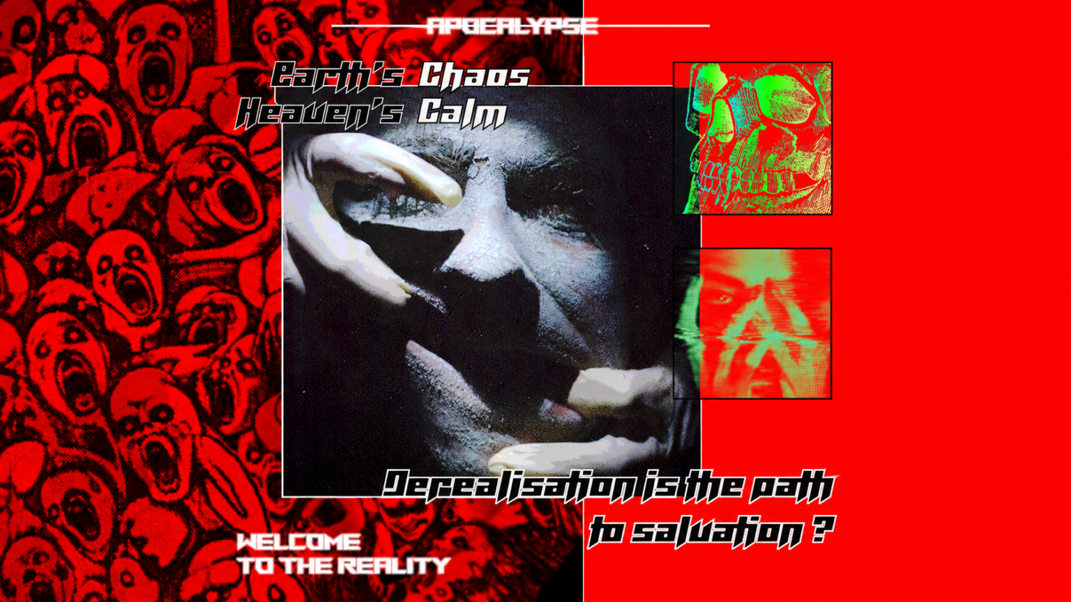
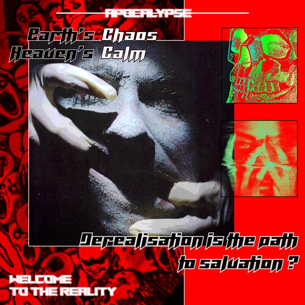
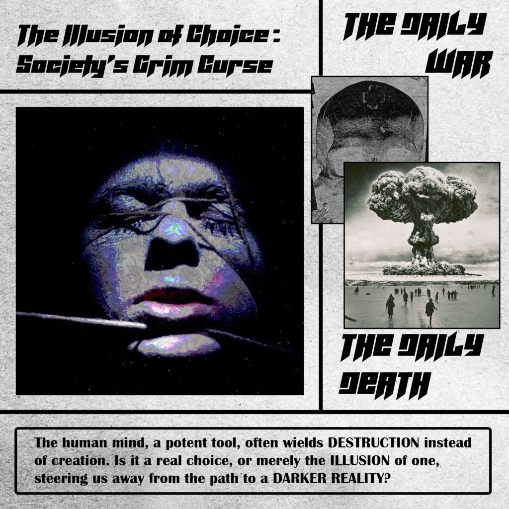
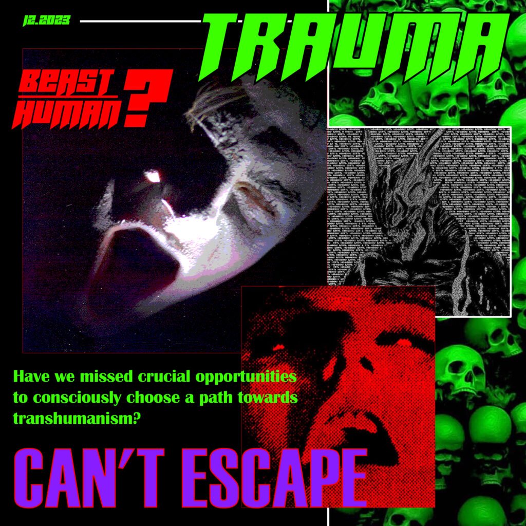
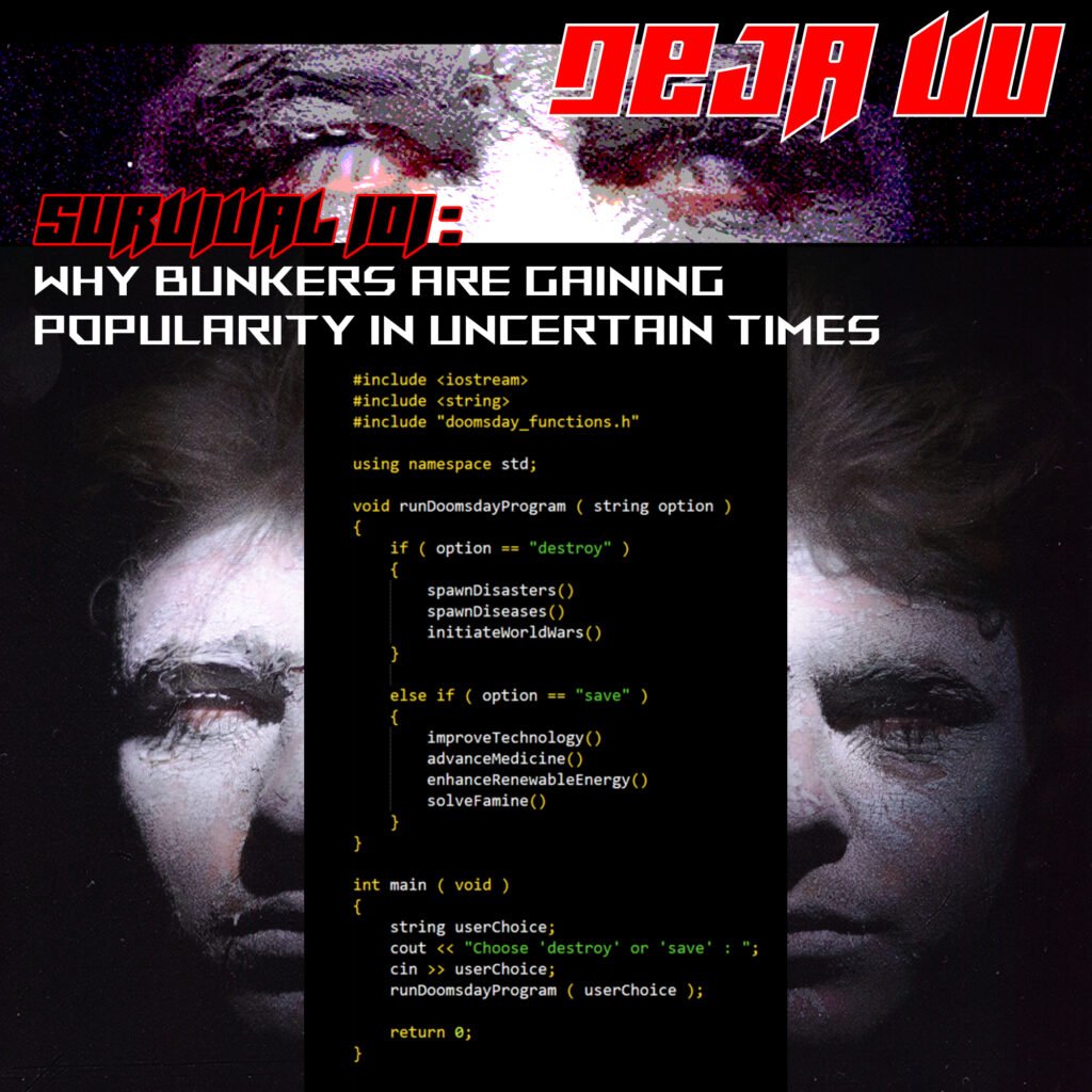
Reality Headlines is a four-piece visual series created in December 2023. Through distorted portraiture, typography, archival imagery and written fragments, the series explores conformity, destruction, human agency and the possibility of consciously directing our evolution.
02 / The Series
01 - PARADISE
From that point, I stopped treating Enter the Void only as an inspiration and started treating it as a visual system to analyze: typography, rhythm, color, motion and perception.
That analysis became the foundation for my own visual language — strongly inspired by Noé’s energy, but redirected toward my own identity.
02 - THE ILLUSION OF CHOICE
From that point, I stopped treating Enter the Void only as an inspiration and started treating it as a visual system to analyze: typography, rhythm, color, motion and perception.
That analysis became the foundation for my own visual language — strongly inspired by Noé’s energy, but redirected toward my own identity.
03 - TRAUMA
From that point, I stopped treating Enter the Void only as an inspiration and started treating it as a visual system to analyze: typography, rhythm, color, motion and perception.
That analysis became the foundation for my own visual language — strongly inspired by Noé’s energy, but redirected toward my own identity.
04 - SURVIVAL
From that point, I stopped treating Enter the Void only as an inspiration and started treating it as a visual system to analyze: typography, rhythm, color, motion and perception.
That analysis became the foundation for my own visual language — strongly inspired by Noé’s energy, but redirected toward my own identity.
04 - SURVIVAL (ANIMATED)
That analysis became the foundation for my own visual language — strongly inspired by Noé’s energy, but redirected toward my own identity.
03 / IDEAS BEHIND THE SERIES
03.1 / THE QUESTIONS
From that point, I stopped treating Enter the Void only as an inspiration and started treating it as a visual system to analyze: typography, rhythm, color, motion and perception.
That analysis became the foundation for my own visual language — strongly inspired by Noé’s energy, but redirected toward my own identity.
03.2 / THE MANIFESTO
We are bordering on a dystopian world. We close our eyes to the bitter truth in fear of not being liked by others, in fear of starting a conscious life, in fear of realizing our worthlessness. We elevate ourselves above others, pursuing false goals in an attempt to gain a sense of self worth.
Instead of creating a worthy purpose, evolving and reconnecting, we point laser sights at each other and in the last seconds of our lives decide to rip the pin off a grenade to take more of other people’s souls.
When someone tries to open our eyes, tries to make us understand, we reject that person. Through clenched teeth we say, “Psycho,” because we are so unwilling to step out of our comfort zone.
03.3 / LOOKING BACK
From that point, I stopped treating Enter the Void only as an inspiration and started treating it as a visual system to analyze: typography, rhythm, color, motion and perception.
That analysis became the foundation for my own visual language — strongly inspired by Noé’s energy, but redirected toward my own identity.
04 / THE ARCHIVE — 2019
04.1 / SOURCE MATERIAL
From that point, I stopped treating Enter the Void only as an inspiration and started treating it as a visual system to analyze: typography, rhythm, color, motion and perception.
That analysis became the foundation for my own visual language — strongly inspired by Noé’s energy, but redirected toward my own identity.
05 / Visual language breakdown
05.1 / REFERENCE
From that point, I stopped treating Enter the Void only as an inspiration and started treating it as a visual system to analyze: typography, rhythm, color, motion and perception.
That analysis became the foundation for my own visual language — strongly inspired by Noé’s energy, but redirected toward my own identity.
REFERENCE 01 Enter the Void — Opening Title Sequence
05.2 / PORTRAITURE
I use a predefined color palette for all my visual work. It makes the process faster, keeps the style consistent, and helps my personal visual language become more recognizable over time.
For this project, the palette helped me keep the whole video connected. Typography, motion, rhythm, and effects could behave differently, but the shared color system turned separate experiments into one consistent visual system.
05.3 / COLOR PALETTE
I use a predefined color palette for all my visual work. It makes the process faster, keeps the style consistent, and helps my personal visual language become more recognizable over time.
For this project, the palette helped me keep the whole video connected. Typography, motion, rhythm, and effects could behave differently, but the shared color system turned separate experiments into one consistent visual system.